THE LINE UP
I worked with Fred & Farid New York to brand its internal talent agency that functions as a multi-expert growth generator and efficiency hub for talent, artists, and athletes. The Line Up combines personalized service and expert management to offer a blend of convenience, accountability, and strategic vision.
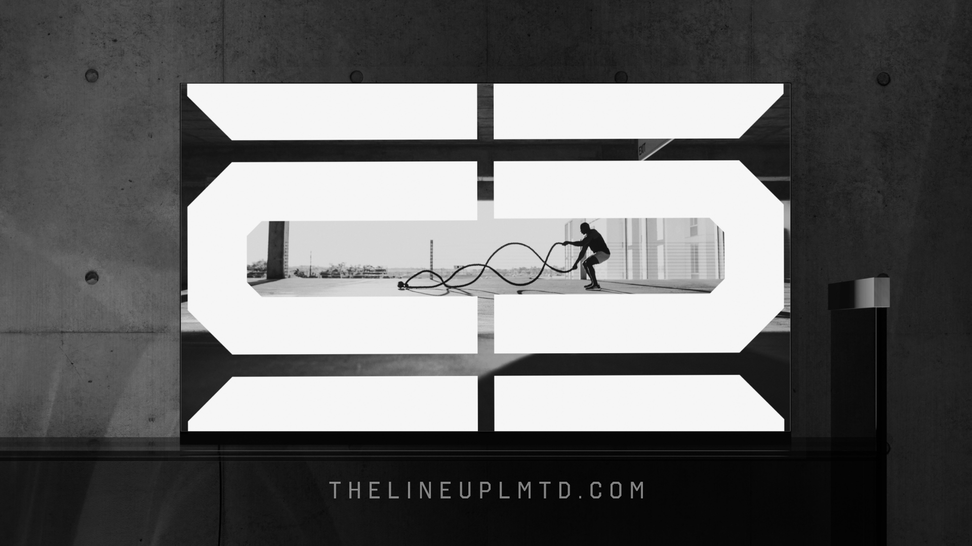
The branding utilizes a distinctive typeface to develop a logo that resembles a lock—a universal symbol for commitment, strength and consistency. The use of B&W photography emphasizes the raw, dynamic nature of sports and the enduring value of its talent. By stripping away color and focusing on form, emotion, and intensity, the athlete portraits stand out in an impactful way.
Position ⏤
Lead Art Director
I worked with Fred & Farid New York to brand its internal talent agency that functions as a multi-expert growth generator and efficiency hub for talent, artists, and athletes. The Line Up combines personalized service and expert management to offer a blend of convenience, accountability, and strategic vision.
The branding utilizes a distinctive typeface to develop a logo that resembles a lock—a universal symbol for commitment, strength and consistency. The use of B&W photography emphasizes the raw, dynamic nature of sports and the enduring value of its talent. By stripping away color and focusing on form, emotion, and intensity, the athlete portraits stand out in an impactful way.
Position ⏤
Lead Art Director